Recently I worked on creating a logo for the Wichita Literacy and Learning. I had to go through a bit of development, see the sketches below. I like working old school with paper and pencil first, then I move to the computer. The first finished design just was not right. After some thinking and reworking here is the finished design… Do you understand the concept?
Posts Tagged 'logo design'
Growing W’s as Books
Published May 23, 2015 experience , Graphic Design , illustration Leave a CommentTags: black and white drawing, book, books, design, development, grow, growth, learning, logo, logo design, organic, pencil, sketch, sketch book, wheat, wichita
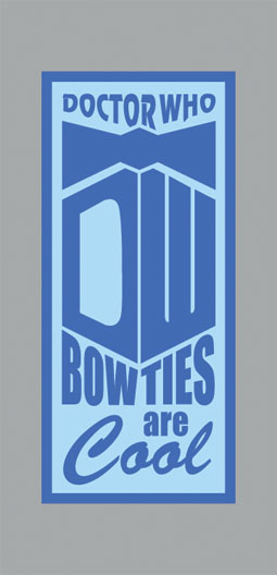
Doctor Who: “Bow Ties Are Cool”
Published February 9, 2012 illustration 5 CommentsTags: art, bbc, bow, bow ties, concept, david tennant, design, doctor who, graphic design, illustration, logo design, new, shirt, show, sitcom, t-shirt, television, ties
This is for all the Doctor Who fans… I know this may seem boring, a rehash or even maybe overdone, but for my husband’s Valentines gift I wanted to find a graphic tee for him. I searched the internet for shirts about Dr. Who, especially “Bow Ties Are Cool”. Every where I looked the graphics were just not my cup of tea so I knew he wouldn’t like them either. In fact I became so frustrated and annoyed that I came up with my own spin. I think this may even look nice as a wood burning or a print.
Hands 2 Serve — Design
Published January 29, 2012 illustration 1 CommentTags: 2, art, color, concept, design, graphic, graphic design, hands, illustration, logo, logo design, ministry, new, pencil, progress, serve, sketch, sketch book, space, trademark
This logo was designed for the Hands 2 Serve Project. Essentially very similar to the Hope In Action Ministry. Members of the project work to improve houses for those in need and are unable to do the work themselves. Like the Hope In Action Ministry all of the work is completed by volunteers (NO they are not paid, but paid through doing a good deed for someone). Design – It was felt that the logo needed to make a bold statement through graphics and color. It would be used both in print and web… and on t-shirts via silkscreen. For the T-shirt, another graphic needed to be designed that would work complimentary with the original.
IF you are interested in volunteering or need further information please Matt Rivers via email mattrivers19@hotmail.com
Here are some additional sketches from the beginning of the project, a glimpse of my design process.


 Hollowpox
 Outlander
 The Grimm Chronicles, Vol. 4
 The Maze Runner Complete Collection
 Illustration Friday